The candlestick chart is such a renowned and mainstream form of interpreting price movements in financial markets that it is considered a default by most market participants.
The truth is that this unique approach to charting market trends was unheard of in the Western world until recently, and began to see wide acceptance in the 1990s. Prior to this, the technique was used by Japanese rice traders over 400 years ago.
The utility of these seemingly simple charts is so immense, that it is unimaginable for a technical trader to go about without referring to the insight it delivers. It has become a critical tool in aiding with capital preservation, and profit maximization.
In this article, we take a deep dive into this technical domain, and cover some of the most intriguing dimensions of the candlestick chart. Learning about this fascinating tool could open you up to a newfound technical competence in the market.
Understanding Basic Candlestick Charts
The candlestick chart, at its most basic level, is simply a tool that tracks the price movement of any given security trading in an open market. These charts are in fact, one of the most popular ways of mapping price change over a given time frame.
Unlike regular price curves, which show movement with a rising and falling line, candlesticks show a far greater deal of information such as opening and closing prices, as well as the highest and lowest price points.
The information conveyed by these candlesticks is simply visualized and can not only help identify trends over time, but can also help predict patterns, and signal trend reversals. As a result, they are phenomenal tools to aid trading decisions.
Candlestick Components
In order to figure out exactly how to read candlesticks, it would be useful to break down an individual candle into its core components. These include the following basic elements:
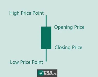
The basic components of the candlestick are all interpreted by the body of the candle, as well as its wicks.
-
Body
The body of the candle represents the difference between the opening and closing price of a security, in a given time period (e.g., a day). The longer the body, the more movement between these two price points.
The color of the body, if left plain, or green, indicates a gain, and if darkened, or red, would represent a loss, as in the image displayed above.
-
Wicks
The wicks of the candlestick chart patterns show the highest and lowest points the security traded at in a given time frame, going beyond its opening and closing prices. Very long wicks show heavy buying or selling pressure at play.
Candlestick vs. Bar Charts
One financial tool that is similar to the candlestick chart, is the bar chart, a classical tool that had been widely used before the introduction of candlesticks. While both convey crucial information about price movements, they have some significant differences:
-
Visual layout
The most apparent difference between both types of charts is in their appearance. While both showcase rectangular bodies, candlesticks use wicks to show high and low points, whereas bar charts use horizontal slits.
-
Emphasis
While technically the information conveyed by each type of chart is more or less identical, the manner in which they are portrayed emphasizes different aspects, which would appeal to different investors.
For instance, bar charts place emphasis on closing prices, and draw comparisons between the closing price of one day to another. Candlestick charts, with their thick body, prioritize price movement in given time periods.
-
Patterns
The unique shapes of candlesticks help to identify specific patterns, and therefore help with predictions. This is made possible due to traders assessing body lengths, wick lengths, and the colors of the candles in a trend.
With bar charts, this degree of pattern identification is not as simple, however, trend analysis can still be performed through other methods.
Basic Candlestick Patterns
When candlesticks are charted together over a range of time, it becomes possible to identify prevalent patterns, and even predict future trends or imminent reversals, with a careful eye. This is why day traders are always on the lookout for such patterns.
In their most basic understanding, candlestick patterns can either be upward trending or downward trending. The graphic below helps visualize a simple downward trend, and points out how to read candlesticks:
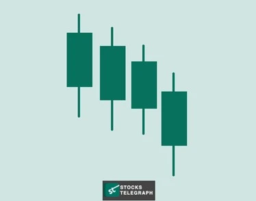
Basic candlestick chart patterns, as demonstrated above, help contextualize how these are used to map price trends for a range of securities, including cryptocurrencies. In fact, the bitcoin candlestick chart is one of the foremost tools among crypto traders.
Bullish Engulfing Pattern
The bullish engulfing pattern is a classic example of a trend reversal seen in a plain manner through the candlestick graph. It shows one small bearish candle, followed by a much larger bullish candle that completely engulfs it by size:
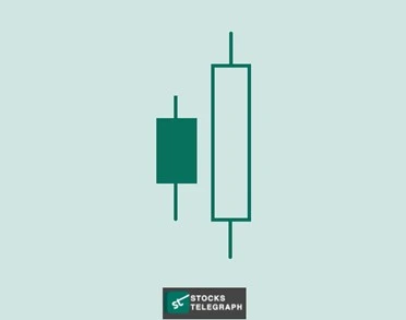
When traders locate this pattern playing out, it indicates a shift in market sentiment from bearish to bullish and growing buying pressure. This is a strong buy signal and confirms a bullish bias in the market, with regard to the particular security.
Bearish Evening Star
Similar to the bullish engulfing pattern, the bearish evening star is another that indicates a trend reversal. This is portrayed by three candlesticks that look like the following pattern:
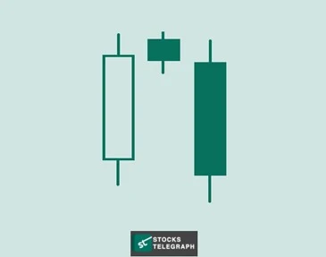
As can be seen, a long rising candle and a long falling candle are both sandwiching a very short-bodied candle which reflects a struggle period between buyers and sellers, with sellers emerging victorious.
The small candle in the middle is the evening star, also referred to as the “harami”, which points to market indecision. This is an early warning signal for bulls to pull out, as upward momentum is imminently approaching a stop.
Bullish Harami Cross
The bullish harami cross is a phenomenon observed on a candlestick chart that indicates an inflection point between a bearish trend coming to a close, and a bullish one taking shape. The pattern appears as follows:
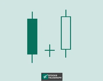
As is evident from the chart, there is a bearish to bullish shift, with a small candle in between and a body size that is barely observable, giving it a distinct cross-shape. This is a strong bullish signal, especially when emerging after an extended downward trend.
Bullish Rising Three
Another candlestick pattern that traders are on the lookout for is the bullish rising three. The pattern indicates the continuation of an upward trend and gives bulls the confidence to maintain their positions for longer. The rising three appear as follows:
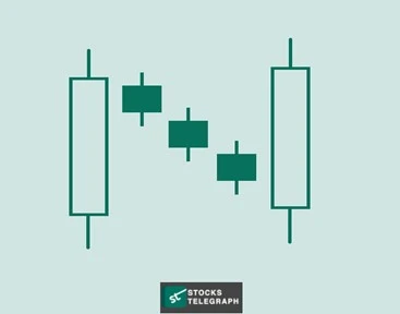
The two, long bullish candles surround three small bearish ones. The bearish sequence showcases a minor correction in the market, which is soon overcome by the bulls.
This pattern is highly informative to market participants, as it informs them of the extent of the bearish pressure, which is soon overpowered by the bullish momentum. The move is a strong buy signal and indicates the currently weak position of the bears.
Bearish Falling Three
The bearish falling three pattern is the complete inverse of the bullish rising three, in the sense that it reflects the continuation of a downward trend, despite a brief bullish correction, which is eventually overpowered by a longer bearish candle.
The candlestick chart for this particular pattern is demonstrated below:
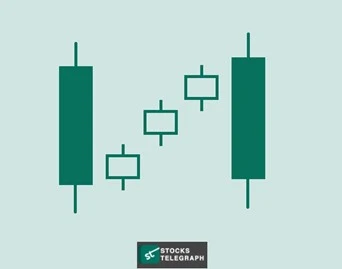
As is evident, two long bearish candles are engulfing three small and successive bullish candles. This phenomenon is a clear sell signal, exposing the extent of buying pressure, which cannot overturn the stronger, bearish momentum.
The series of bullish candles in the middle of the pattern suggest a brief attempt at consolidation, which takes place to no avail. As such it indicates that bears hold a dominant position at the present moment, and will likely control the trend.
Conclusion
The candlestick chart is a powerful tool used in a range of markets by laypersons to skilled experts, due to its strengths in pattern identification. Unlike other charts such as the trend line, candlesticks convey a lot of information with visually simple figures.
A candlestick pattern is a simple tool that can have some really sophisticated applications, such as the bitcoin candlestick chart. Those that are familiar with the various patterns, and what each signal points to, hold a heavy lead against the wider market.
By incorporating this phenomenal tool in your trading strategy, you would not only be able to preserve your capital when most suffer through losses, but you would also react to market shifts even before they play out, and maximize your wins.
FAQs
How To Read Candlestick Chart For Day Trading?
For day trading, you would need to look at the candlesticks on the chart, including their upper and lower wicks, body length, and candle color. All of this must be assessed against a broader horizon to identify patterns, and make predictions.
How To Make A Candlestick Chart In Google Sheets?
Here’s how to make candlestick charts in Google Sheets:
- Organize your data into columns for date, open price, high price, low price, and close price.
- Select your data.Insert a candlestick graph from the chart editor.
How To View Candlestick Chart In Robinhood?
To view charts in the candlestick form, select a particular stock in Robinhood, and then go to the chart icon. It will portray a candlestick option, which is to be selected to see price movements by candlesticks.


